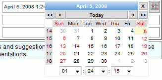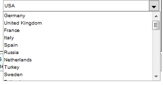
Pop-up calendar simplifies date and time entering
Text and Button Components is a class of GWT widgets which has a text box and a button joined in one component. The oldest widget of this class is the Date Picker. It allows entering date and time using pop-up calendar panel. Major features of the Date Picker are:

Combo Box allows entering your own custom value instead of choosing it in the drop down list
Another one widget is ComboBox. You can enter a new value directly in the text field or choosing it from the drop down list. Key features of this widget listed below:

Displaying complex drop down list items is not a big deal for the Suggestion Box
And the last widget is the Suggestion Box. It's an extension of the Combo Box and supports the same features but has several additional ones:
The sample below shows how to use the Date Picker
DatePicker picker = new DatePicker(new Date());
// swicth off time entering
picker.setTimeVisible(false);
The next sample demonstrates how to create a new Suggestion Box and make it fill the model on change.
//create the model and callback handler
SuggestionBoxDataModel model = new SuggestionBoxDataModel(new ListCallbackHandler(){
public void fill(ListDataModel model) {
    if ("John".equals(((SuggestionBoxDataModel)model).getExpression())) {
        //remove old values
        model.clear();

        //add Johns
        model.add("john1", "John Doe");
        model.add("john2", "John Parkinson");
        model.add("john3", "John Todd");
    } else {
        //remove old values
        model.clear();

        //add default item
        model.add("", "Nobody");
    }
}
});

//initilize the suggestion box
SuggestionBox box = new SuggestionBox();
box.setModel(model);
box.setMaxLength(3);
The source code for the Combo Box will be similar but note that you can't create callback handlers.